Custom alignment guides in SwiftUI
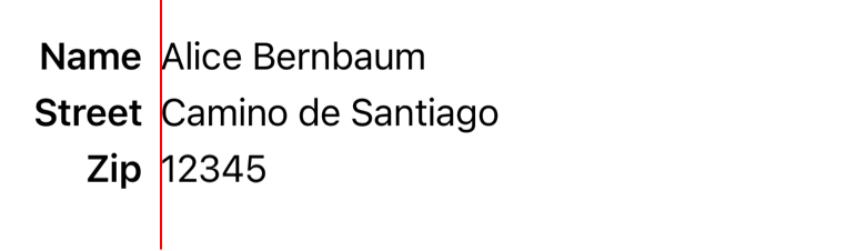
How to use custom alignment guides to align views across different levels in the View hierarchy:
struct ContentView: View {
    var body: some View {
        VStack(alignment: .labelsLeading, spacing: 5) {
            HStack {
                Text("Name")
                    .bold()
                Text("Alice Bernbaum")
                    .alignmentGuide(.labelsLeading) { dimensions in dimensions[.leading] }
                Spacer()
            }

            HStack {
                Text("Street")
                    .bold()
                Text("Camino de Santiago")
                    .alignmentGuide(.labelsLeading) { dimensions in dimensions[.leading] }
            }

            HStack {
                Text("Zip")
                    .bold()
                Text("12345")
                    .alignmentGuide(.labelsLeading) { dimensions in dimensions[.leading] }
            }

            Spacer()
        }
        .padding()
    }
}

extension HorizontalAlignment {
    private enum LabelsLeading: AlignmentID {
        static func defaultValue(in dimensions: ViewDimensions) -> CGFloat {
            // The defauftValue is used when no alignmentGuide is set.
            dimensions[.leading]
        }
    }

    static let labelsLeading = HorizontalAlignment(LabelsLeading.self)
}
↗ Aligning Views Across Stacks
↗ Explanation from WWDC 2019: Building Custom Views with SwiftUI
 Blog
Blog Subscribe
 Follow
 Example project